A+E Digital Design System

The Design System encompasses the elements of style, serving as the building blocks for a brand's digital presence. It highlights the detail and craftsmanship invested in every component and screen, from the user interface to iconography, shaping the way users perceive the experience..

Our challenge was to unify three brands under a single-minded design system that captures the spirit of each.

Mobile

Design System as a product itself.

A+E Networks design system is not merely a tool or set of guidelines; rather, it is a product in its own right. It is a comprehensive ecosystem carefully crafted to serve as the foundation for all design elements within a brand. Comparable to a meticulously curated product, the design system encapsulates the A+E portfolio of brands' visual language, interactive components, and guidelines. It is a dynamic and evolving entity, requiring thoughtful development and maintenance. As a product, it delivers consistency, efficiency, and a unified brand identity across various touchpoints, making it an indispensable asset for both designers and stakeholders.

Mobile

Buttons - Navigating Audiences Seamlessly Through Each Experience

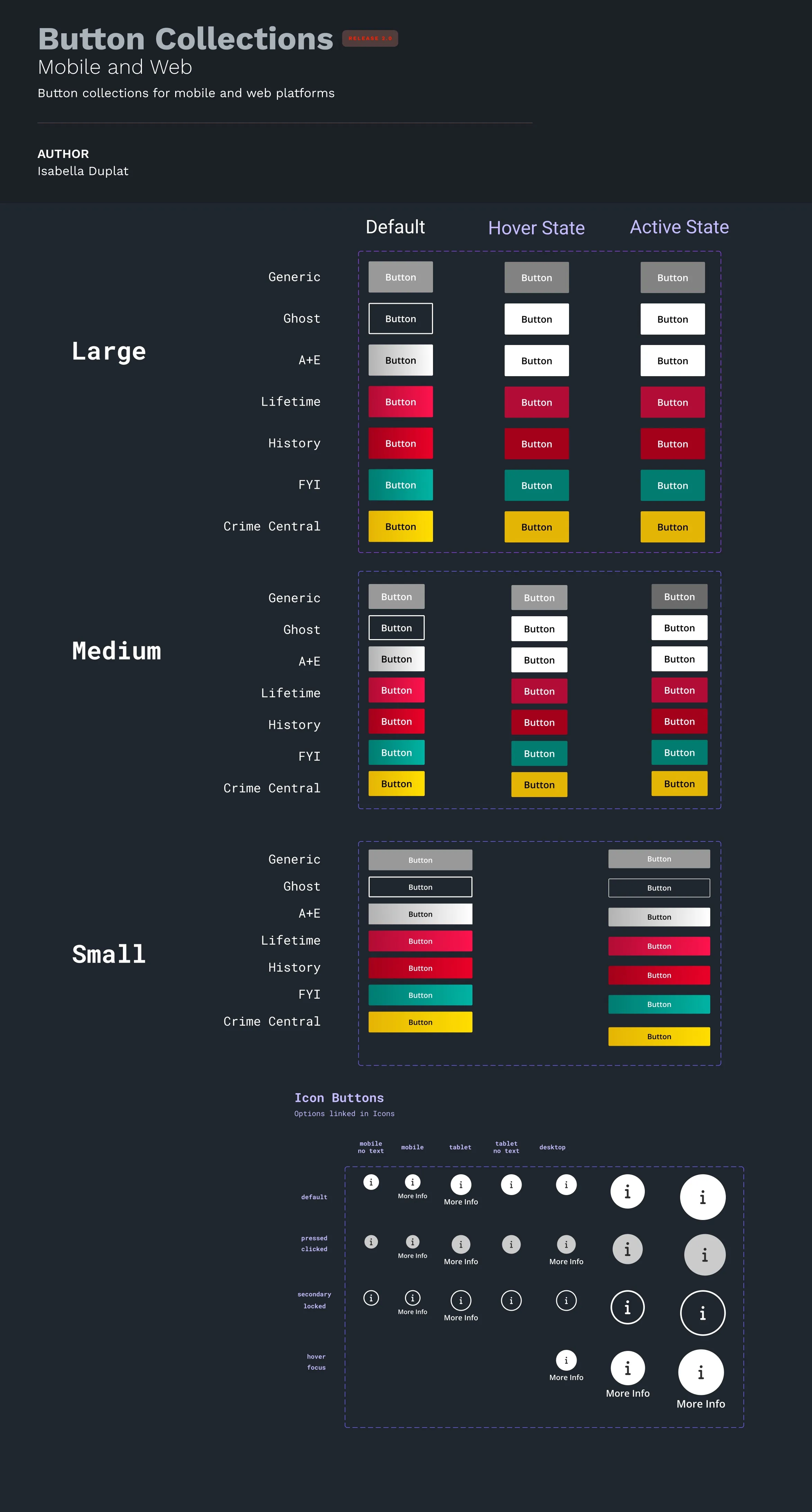
One of the product design team's goal was to streamline the button component, culminating in a comprehensive button system derived from a singular "base" button component, which was accomplished by structuring the component to integrate conditional statements, aligning with the methodology employed by our engineering counterparts.

Mobile

Icon System.

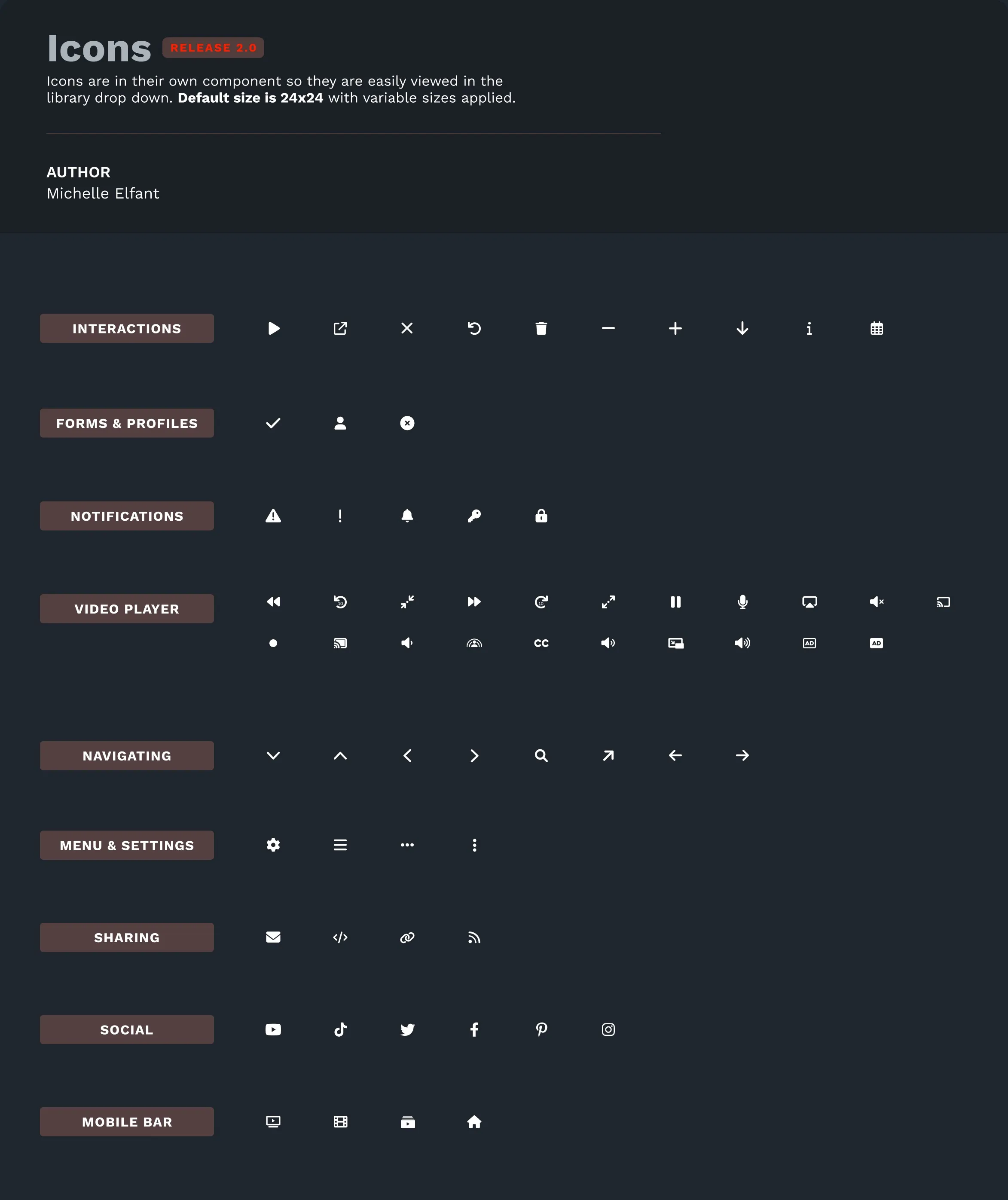
It's safe to say that icons play a pivotal role in a design system, serving as visual anchors that enhance user experience across digital interfaces. These small, graphic representations transcend language barriers, communicating information quickly and intuitively. In a design system, icons provide consistency, aiding in brand recognition and establishing a unified visual language.

By carefully crafting and standardizing icons, the Product Design team ensured a seamless and cohesive user journey, promotion both usability and aesthetic harmony.

Mobile

Brand colors and beyond.

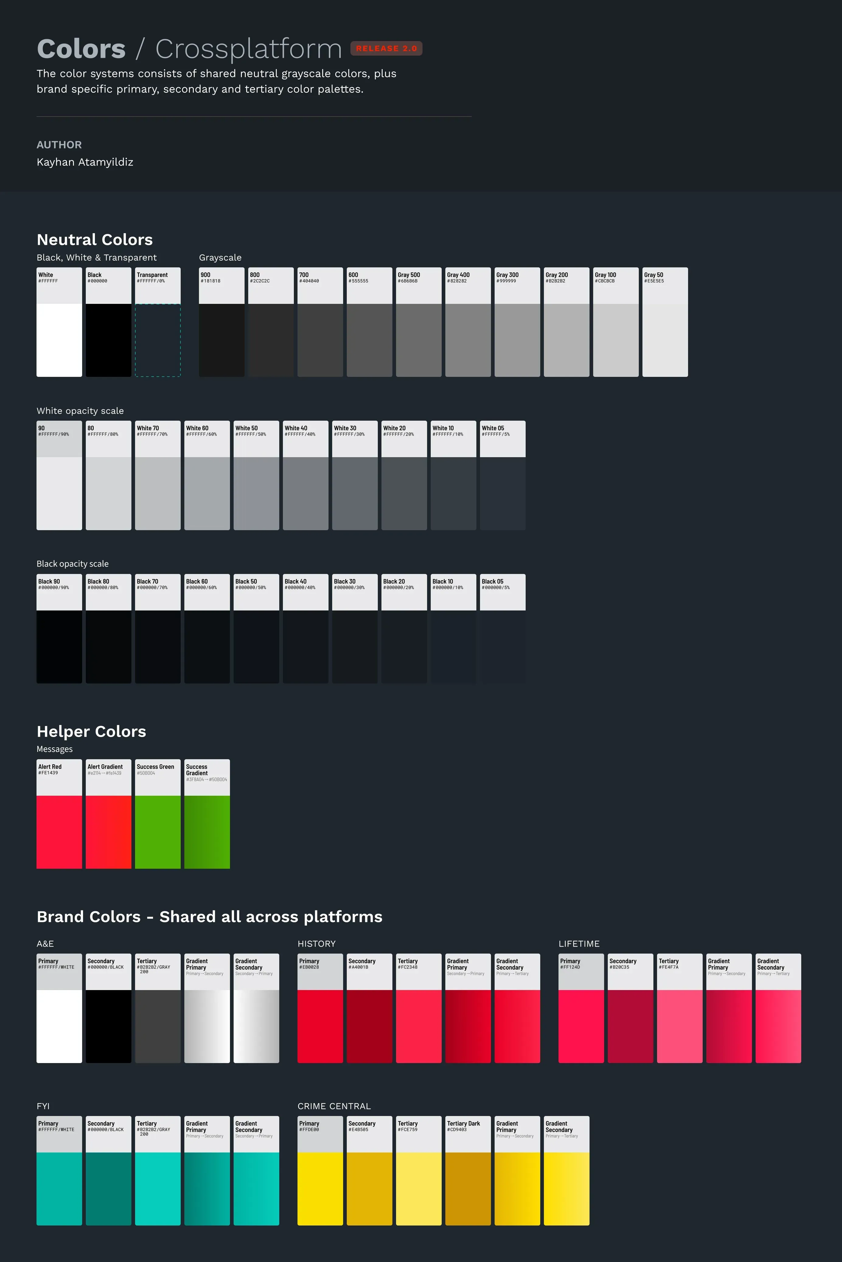
The design system's color palette is crafted to cater to the diverse portfolio of A+E Networks brands. In addition to a dedicated palette featuring neutral colors along a black and white opacity scale, each brand possesses its unique primary, secondary, tertiary, and gradient color palettes.

Mobile

Open Sans for Typography

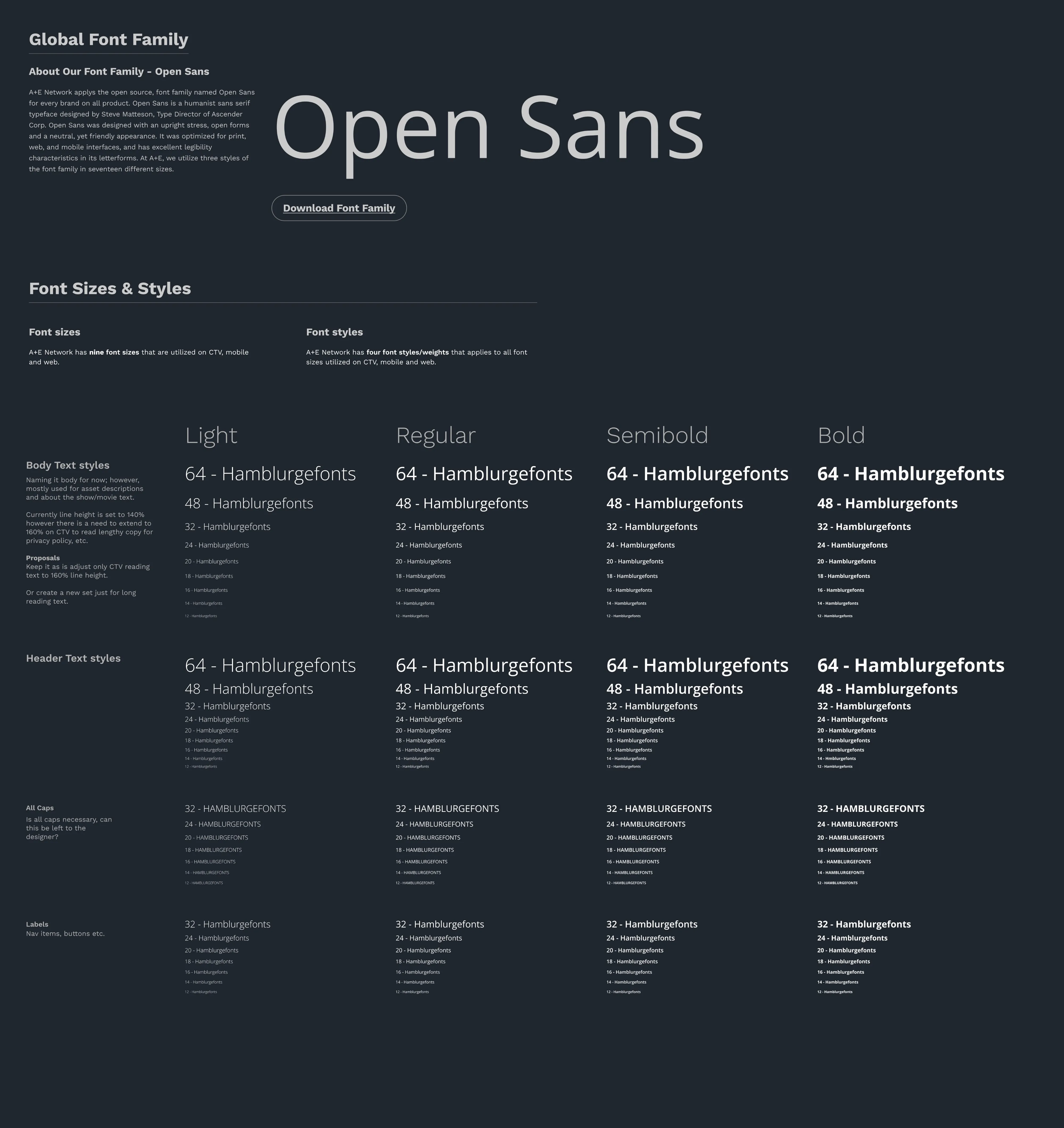
A+E Networks utilizes the Open Sans font family for all its digital products to ensure a unified experience. The product design team opted for a minimal typography scale comprising headers, body copy, all-caps, and labels, which proved effective for the streaming media experience on mobile, web and connected TV. Each scale incorporates a percentage-based line height with four different font weights: light (300), regular (400), semibold (600), and bold (700), respectively.

Designers on the team have complete autonomy in choosing font weights for headers, body copy, app-caps, and labels. This grants them creative freedom to implement the best design solutions that bring value to the audience.

Mobile
Mobile

Atomic Design Principles

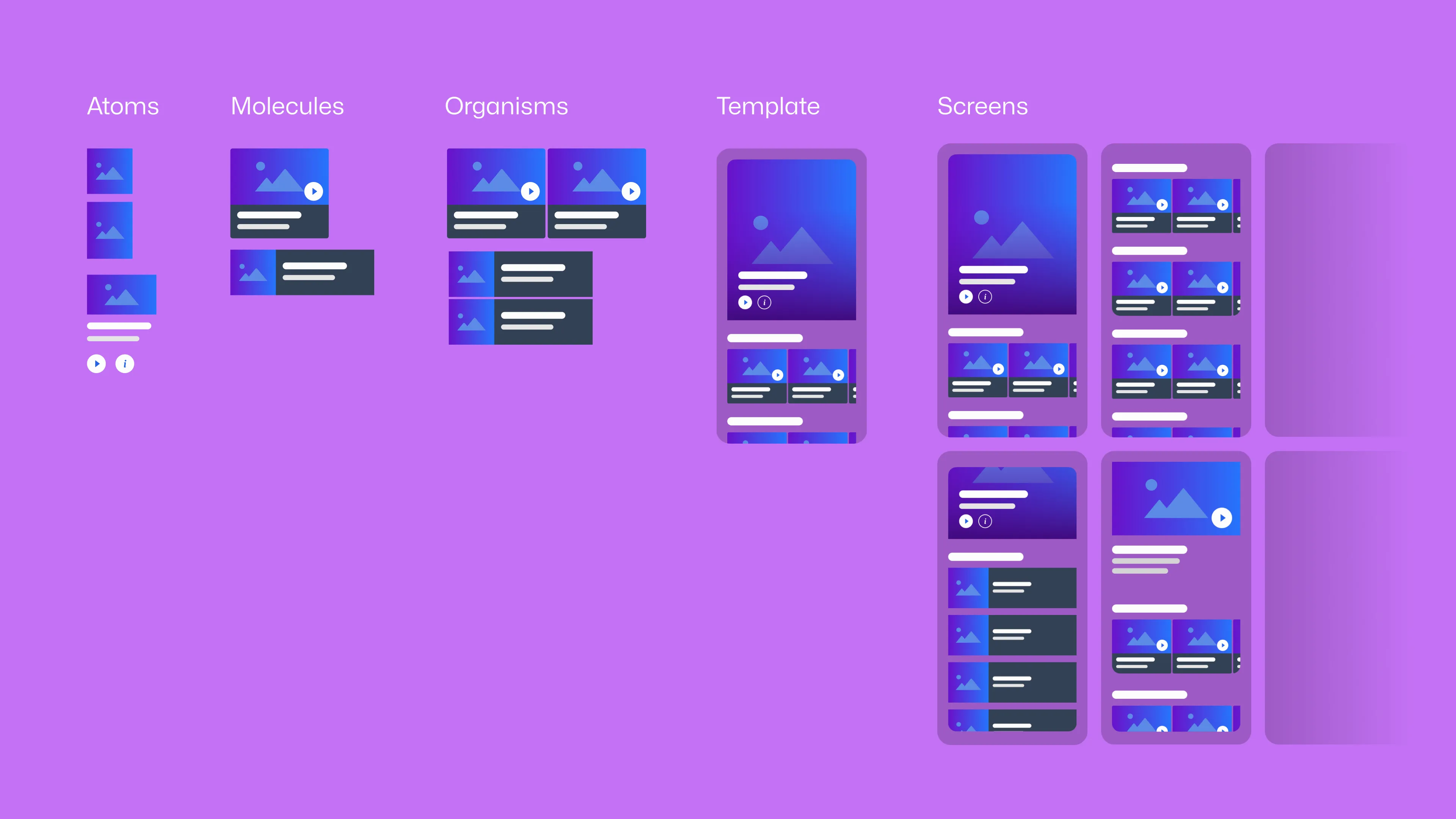
The A+E digital product design team embraces Atomic Design Principles as a transformative approach to constructing a design system that is not only sustainable but also highly scalable.

By breaking down complex user interfaces into fundamental building blocks, or "atoms," and systematically assembling them into more comprehensive components and layouts, Atomic Design helps A+E product teams streamline the design and development process.

This methodology not only enhances the consistency and efficiency of design implementation but also fosters adaptability and extensibility over time. It provides a solid foundation for creating and maintaining a design system that can effortlessly evolve with the growing demands and complexities of digital experiences.

Mobile

Simplifying the Design System with Figma variables.

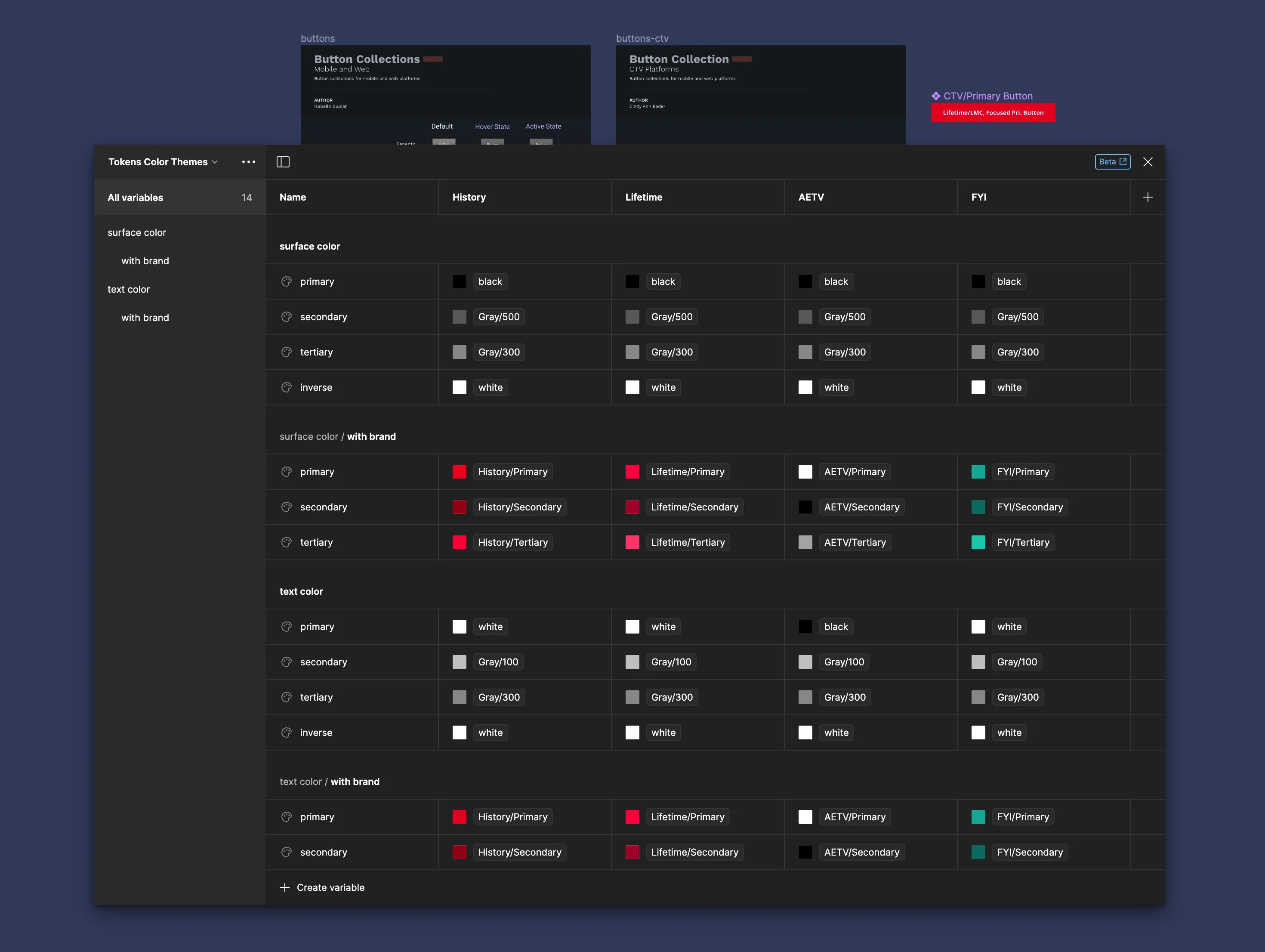
As an integral design tool, Figma has remarkably reduced the maintenance costs associated with developing intricate components within our Design System. The introduction of variable tokens has notably streamlined the scaling process for colors, spacing elements, and grid layouts, facilitating rapid prototyping with exceptional ease.

Mobile

Viewport centric design system.

Embracing a viewport-centric design system offers additional advantages. A+E Networks product designers work with a token/variable-based design system that significantly reduces the effort needed to create design solutions for diverse digital platforms, which ensures seamless adaptability across various screen sizes and resolutions, enhancing the overall efficiency and versatility of the product design team's approach.

Mobile

Providing detailed design spec for the engineers.

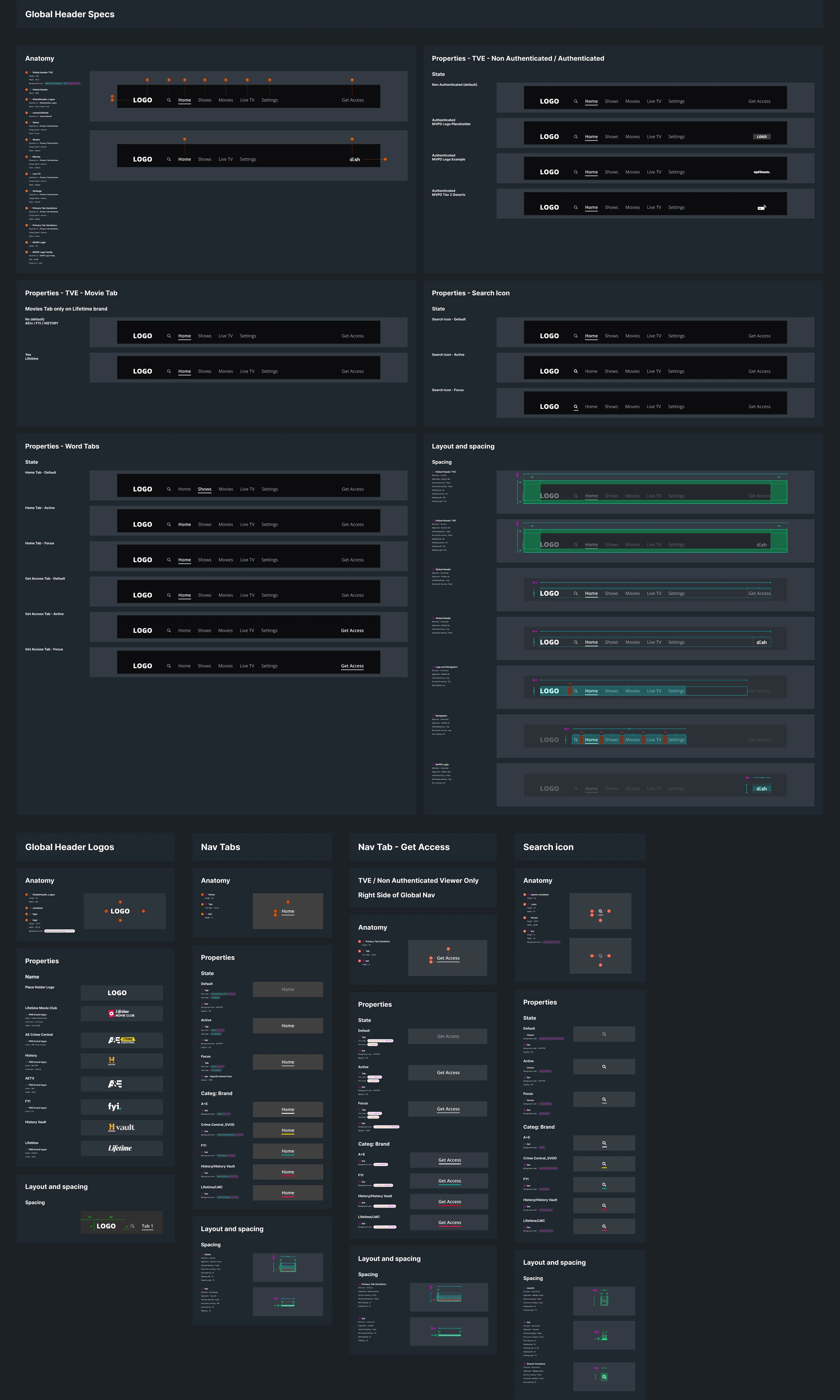
The product design team creates detailed design specification frames that highlight essential details, including the layout, spacing, anatomy, and instance properties of various design elements. This thorough documentation proves invaluable during the handoff from designers to developers and fosters collaborative design critiques among team members.

This intentional approach contributes to a smoother, more cohesive design process, enhancing communication and understanding within the cross functional teams.