 Kayhan Atamyildiz Kayhan Atamyildiz
 A recognition experience for the Ellis Island National Museum of Immigration that places each major gift on the museum's own immigration timeline — so a donor is remembered by their story, not by the size of their name on a wall.
Recognition earned by year rather than by gift size — one story template carrying a family and a Fortune 100 insurer with equal weight.

The Foundation already knows how to put a name on a wall — the Wall of Honor has been doing it for decades, and it works precisely because it is a monument. But the donors funding the museum's reimagined Timeline of Immigration weren't giving to see their names carved somewhere. They were giving because of a story: Deborah Simon honoring her grandparents, the Donovans and Michael's own immigration, Liberty Mutual founded in 1912 in the middle of the largest arrival wave in American history. Recognition that flattened all of that into a tiered sponsor list would have thrown away the only thing that made these gifts personal. The brief was recognition — but the material was narrative, and the two wanted very different designs.
Two constraints shaped everything else. First, whatever I designed would not be built by me — the Foundation runs a heavily customized WordPress install and their engineering team would be writing the templates. Second, the donor stories would never all arrive at once. Copy and archival assets had to be gathered and approved donor by donor, so the plan was always to launch with whatever was ready and keep adding. Neither of those wants a bespoke, hand-tuned artifact. Both want a system: one that survives translation into someone else's stack, and one that is never actually finished.
Each one gave something up. Naming what it cost is the honest part.
Every donor became a year. The landing page is a coverflow carousel running 1887 to 1967 — the Hearst Foundations at 1887, Michael & Linda Donovan at 1967 — and each card carries a year, a name, and a reason: "Founding of the Hearst Corporation," "To honor their ancestors." No amounts. No tiers. Placing a donor in time rather than in a ranking is what lets a family and a global insurer sit next to each other without either one looking out of place.
Tradeoff → SOLEIF asked early about donor categories — Platinum, Gold, Silver — as the program grows. Giving every story equal weight means the design has no way to express giving levels without a redesign. I bet that a timeline where a family sits beside a corporation serves an immigration museum better than a leaderboard does.

In reading the donor copy, two distinct narrative styles emerge: individuals and families tell personal, chronological stories, while corporations present brand histories. The obvious move was two templates. I built one. A single scroll-driven scaffold — hero with year and name, alternating copy and image grids, a year nav at the foot of every page — turned out to be flexible enough to carry both. Liberty Mutual's page opens on Ellis Island, moves through the company's own century, and returns to Ellis Island. Deborah Simon's honors her grandparents. Same bones underneath.
That decision is what made the rolling launch possible. Because every story runs on the same scaffold, the site could go live with the donors whose copy and archival assets had cleared approval, and absorb the rest as they landed — without a design pass each time.
Tradeoff → One template means the corporate stories and the family stories look like siblings, and a brand accustomed to its own art direction gives up some distinctiveness. That sameness is the point — it is what makes separate pages read as one museum speaking, rather than a set of sponsor pages wearing a shared header.

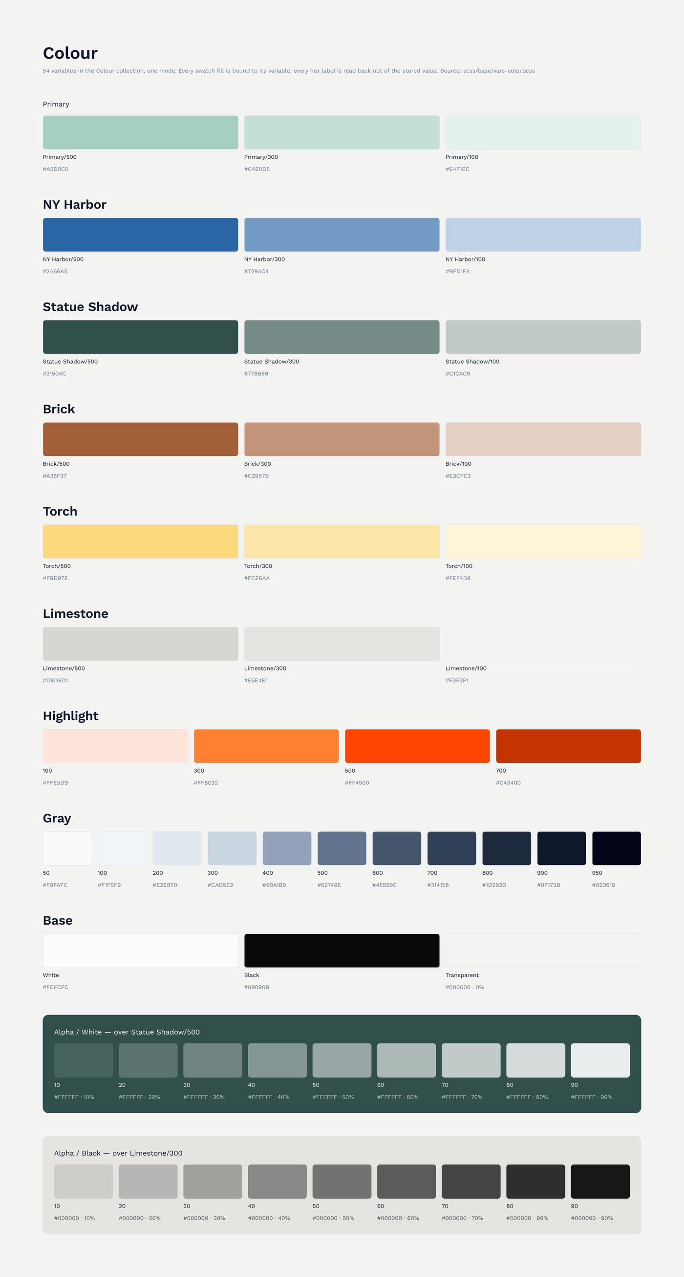
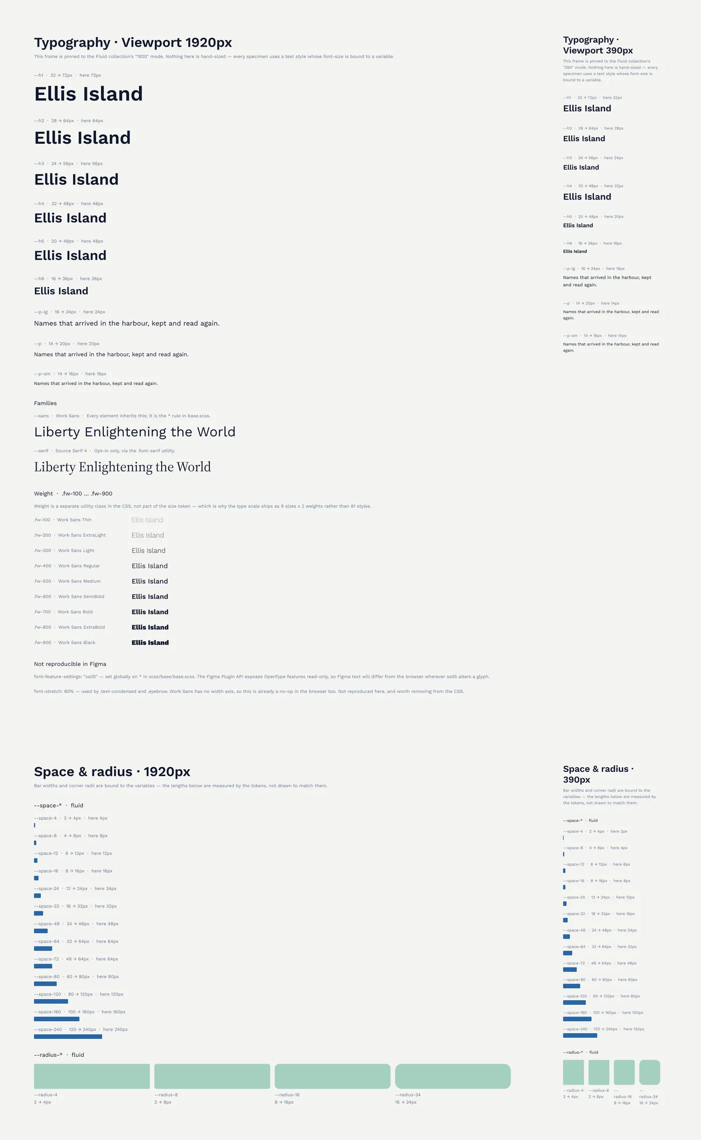
Rather than hand over comps and annotations, I built the whole thing as a working static site: hand-authored HTML, SCSS compiled to a single stylesheet, vanilla JS, and GSAP ScrollTrigger and SplitText driving the word-by-word copy reveals and the image parallax. All of it authored as a token system — fluid clamp() type and spacing, a small set of grid utilities, one page scaffold repeated across every donor page. The Foundation's engineers took that and shipped it as a WordPress plugin with PHP templates.
Tradeoff → Writing a real prototype cost considerably more than producing comps would have. What it bought was a specification that couldn't be misread — engineering got the actual easing curves, the actual breakpoints, and a running reference to diff their build against instead of a stack of redlines and a guess about the motion.
I audited the built site against WCAG 2.1 AA once the plugin was running. The word-by-word reveal — the effect that makes the copy feel like it's arriving — works by splitting every paragraph into individual word spans. Gorgeous on scroll. In NVDA it turned continuous prose into a list of disconnected words. That got fixed, along with keyboard access to the year controls, hidden carousel slides sitting in the tab order, missing focus indicators, decorative images carrying alt text they shouldn't, and a live region so the carousel announces itself when it moves. Thirteen findings, eleven fixed, two deliberately deferred.
Tradeoff → Keeping the reveal rather than deleting it means carrying an accessibility fix around forever. I kept it — the motion is doing real work on a site about arrival — but it now has a maintenance cost that a plain paragraph would not.

The experience is live at statueofliberty.org/timeline-of-immigration, currently carrying seven donor stories from 1887 to 1967 — the Hearst Foundations, Ernst & Young, Ann & Andrew Tisch, Deborah J. Simon, Liberty Mutual Insurance, Morgan Stanley, and Michael & Linda Donovan. It runs inside the Foundation's WordPress site, built by their engineering team from the prototype. The timeline went live with the stories that were ready and grows as new ones clear approval — adding a donor is a content entry, not a design project. That was the whole bet: not a beautiful one-off, but a template the Foundation could keep using without calling anyone.
The prettiest thing on the site was the thing a screen reader couldn't read. I'd rather find that in an accessibility audit than never look for it — on a project about other people's arrival stories, an experience some visitors can't get through isn't a finished experience. The harder discipline was earlier, though: resisting tiers. Every instinct in donor recognition pulls toward ranking the gift, and the whole point of putting these people on a timeline was that history doesn't rank arrivals.